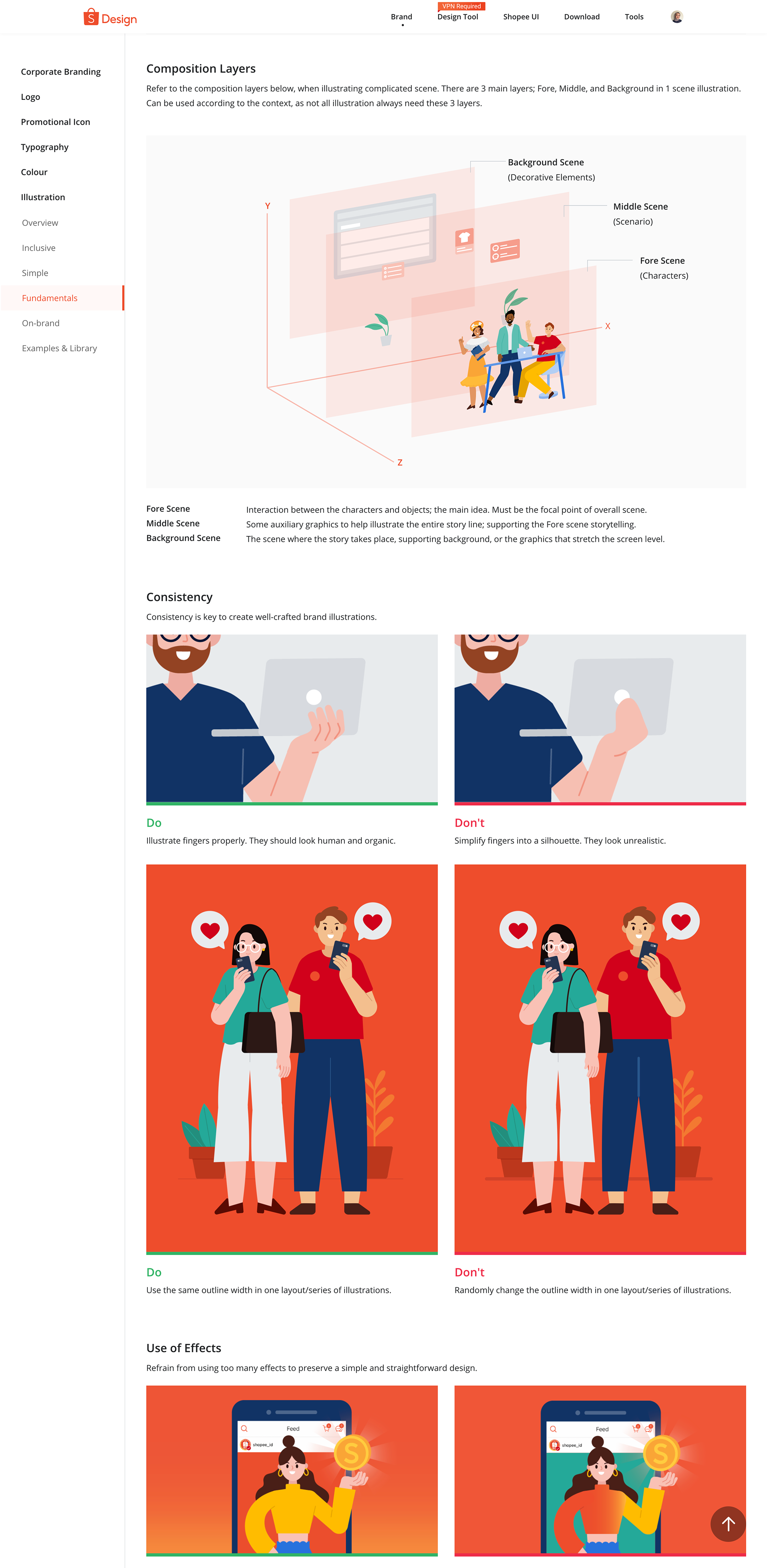
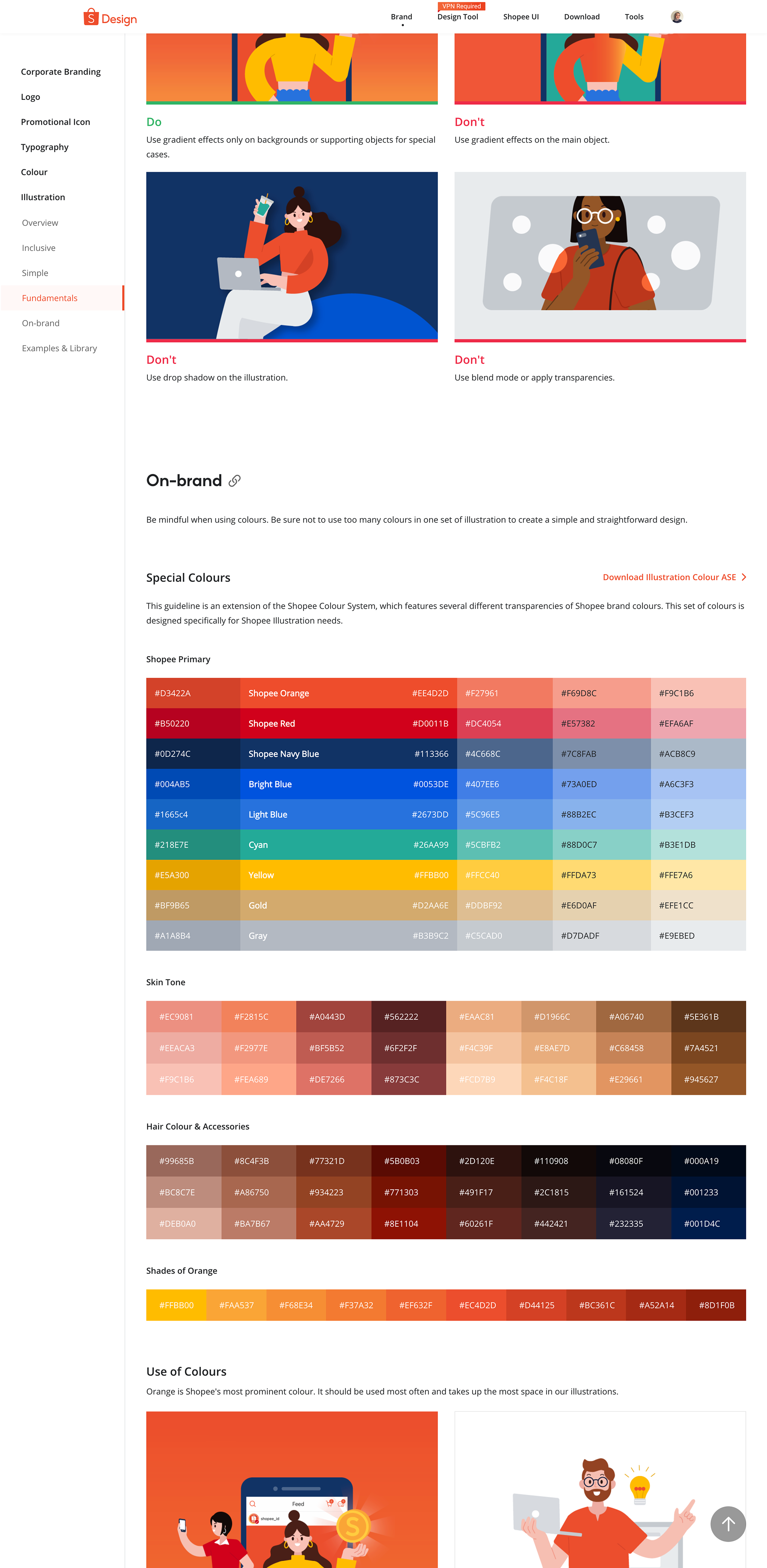
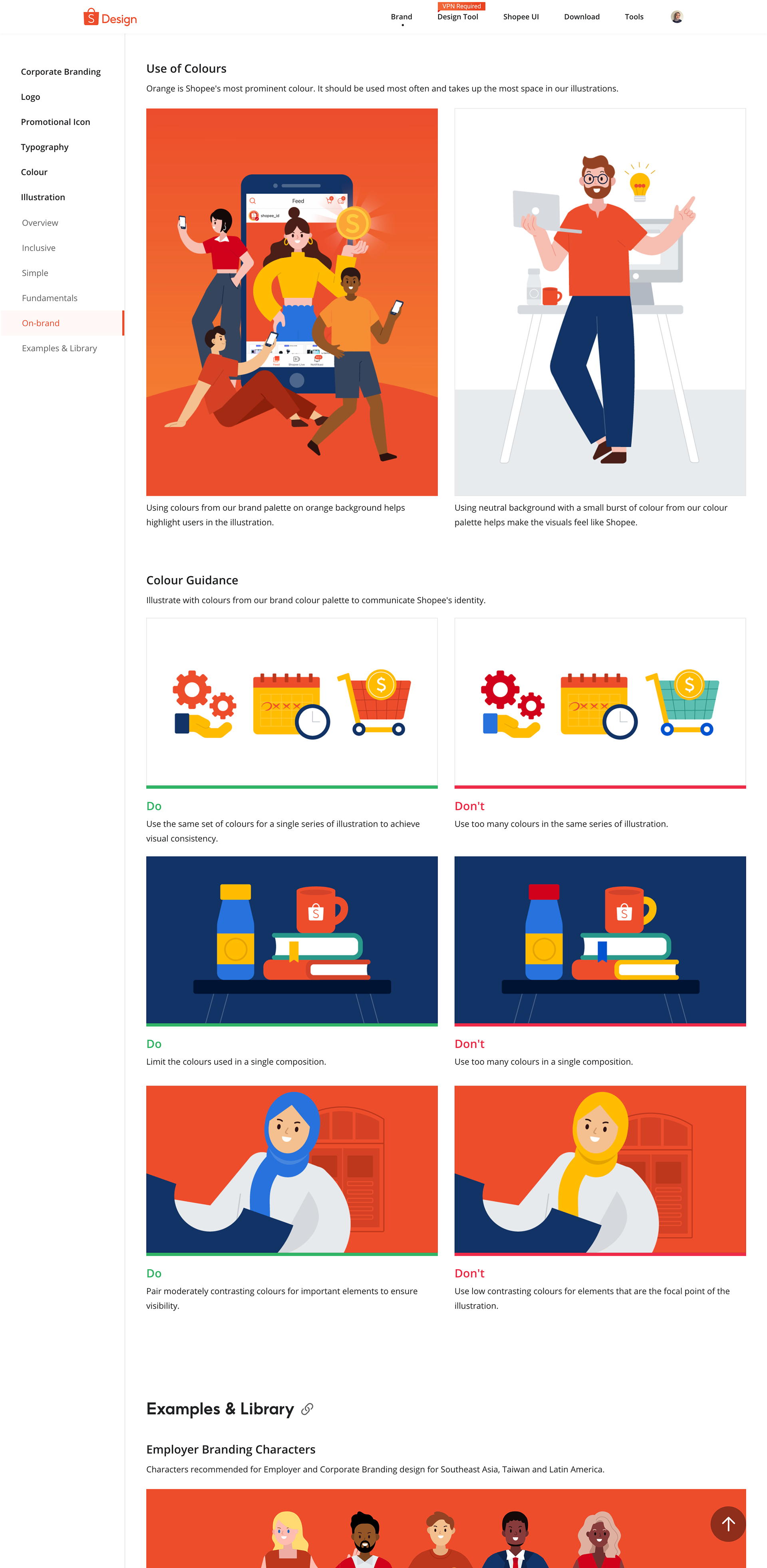
Illustration Guideline & Library
When I joined Shopee in 2020, I was part of the Brand Design team under the Regional Design department in Singapore. As a dedicated brand design team working alongside the product design function, our role was to proactively develop creative solutions that could streamline and elevate the company’s design processes.
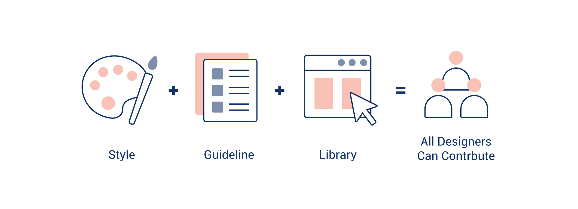
One of our key initiatives was to build a comprehensive illustration system and guideline that could be adopted consistently across the entire Shopee brand.
My Role: At the time, I was tasked with leading the initiative to research and create a consistent illustration style, along with guidelines for its use in both product and marketing materials.
Four years later, I’m pleased to see that this library is still actively used in PR materials, internal communications, and online marketing by both regional and various local teams! While the illustration style itself is quite simple, I’m proud that this project has had a significant impact on the company’s design ecosystem.
Below is the article I wrote in 2021 that explains the process I followed when working on this project.
Shopee Illustration Library Introduction Video
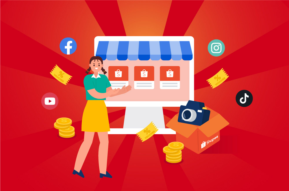
The Power of Illustrations
Illustrations are excellent at reimagining ideas in an engaging and dynamic way, especially when words aren’t enough to express a concept. From print ads to the digital era, they have always played a key role in promoting products and reinforcing brand values.
In recent years, we see them become increasingly popular amongst big players like Google, Facebook, Dropbox, Uber, and more, as these companies aim to strengthen their respective brand identities through unique styles of their own.
As a growing multinational e-commerce company, it is also imperative for Shopee to build such a system to bolster their visual consistency and brand recall.
The Problem
Before we even started to look further into the different approaches to even start designing, we had to first identify the problem by discussing these questions:
1. Why should there be an illustration guideline for Shopee?
2. Why don’t we create every image as needed?
Plan Overview
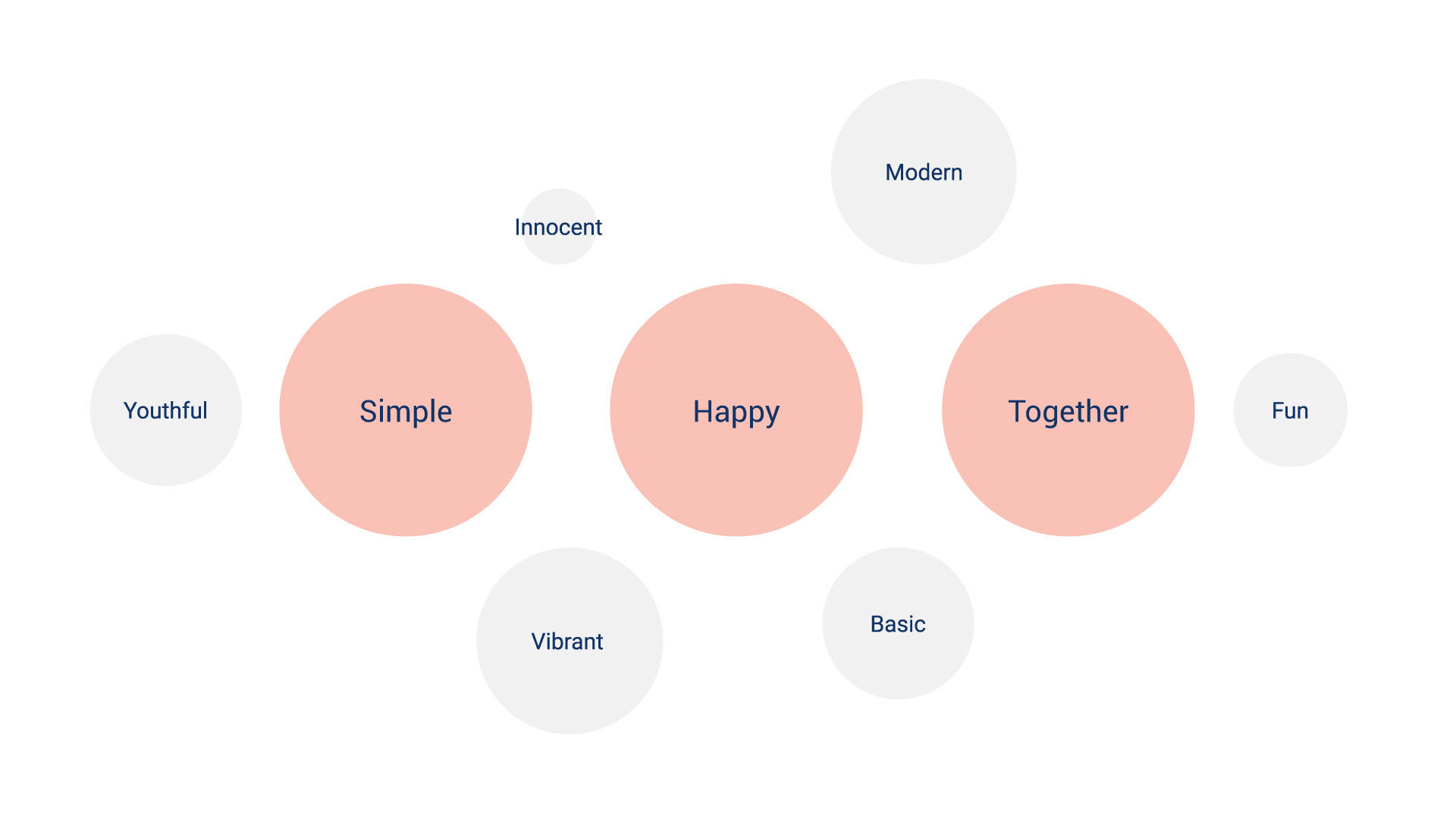
As with every design project, setting the scene is critical before getting into the main plot. We initiated our plan by defining the style first. We did this by taking references from Shopee brand personality, “Simple, Happy, Together”. After which, we built the guideline and library.
Once those materials were in place, my team would promote the usage to the local teams. The local designers could then localise them and produce visuals more relevant to their audience based on the regional guideline.
1. Searched for references (internal and external)
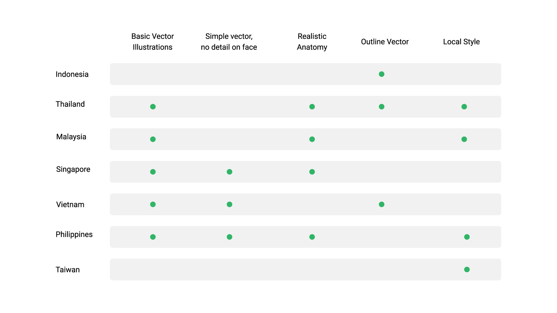
First I did a thorough audit of all the current states of illustrations used by Shopee in the past and discovered many different styles used across the region.
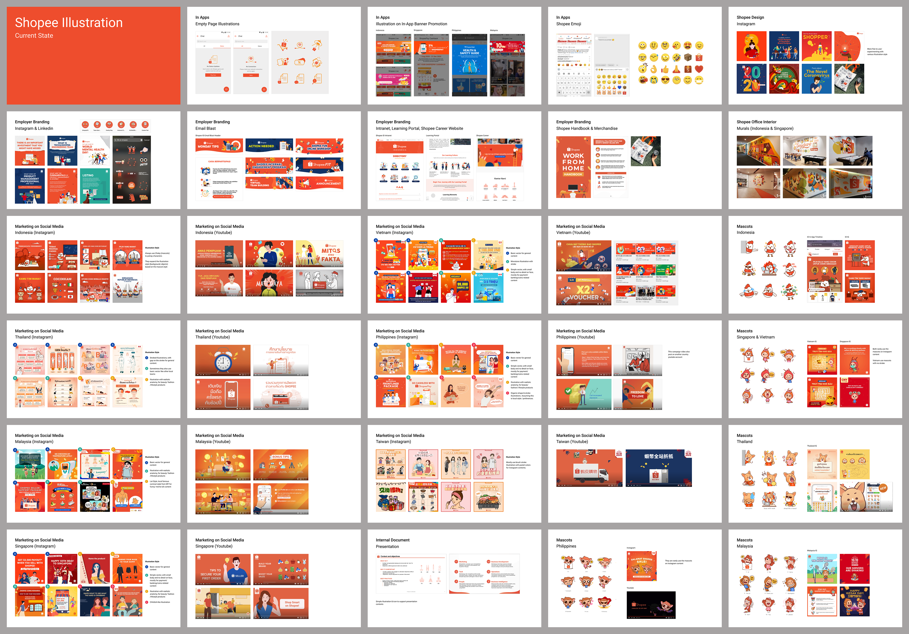
While I understand and respect the localisation effort from local teams, it is also crucial to maintain a consistent style globally for better brand recall. We did not want to create the guideline to replace their illustrations but to build a deeper bond with our audience through familiarity.
I also researched brands such as Google, Airbnb, Uber, Gojek, Dropbox, just to name a few, to learn how they communicate their identities. I compared design keywords in every brand and took references on the structure and content to build our guideline.
2. Referenced our brand personality: Simple, Happy, Together
We used these three keywords as our core foundation to develop our style while incorporating other supporting keywords like fun, innocent, modern, youthful, and vibrant.
I started the design process with a mood board to help clarify the often abstract initial direction. In this instance, I created a mood board based on the references extracted from the keywords stated to determine our illustrations’ overall look.
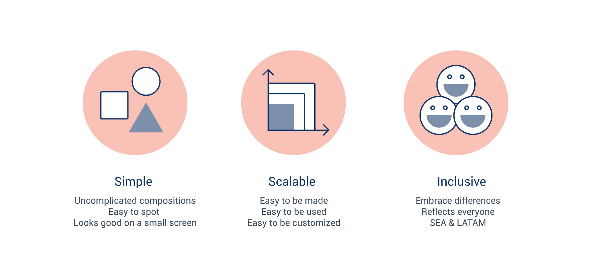
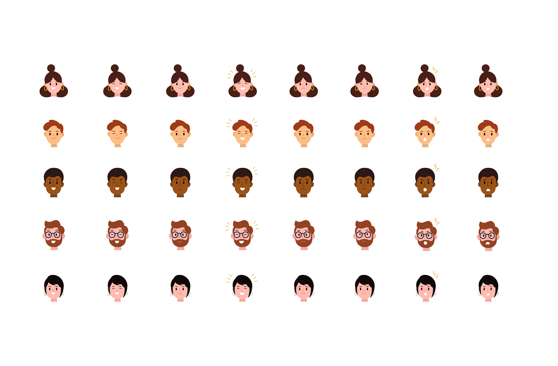
3. Determined the direction: Simple, Scalable, Inclusive
a. Simple. The Illustration style should be simple and straightforward.
b. Scalable. The Illustration style should give designers enough freedom to create, use and be customised easily.
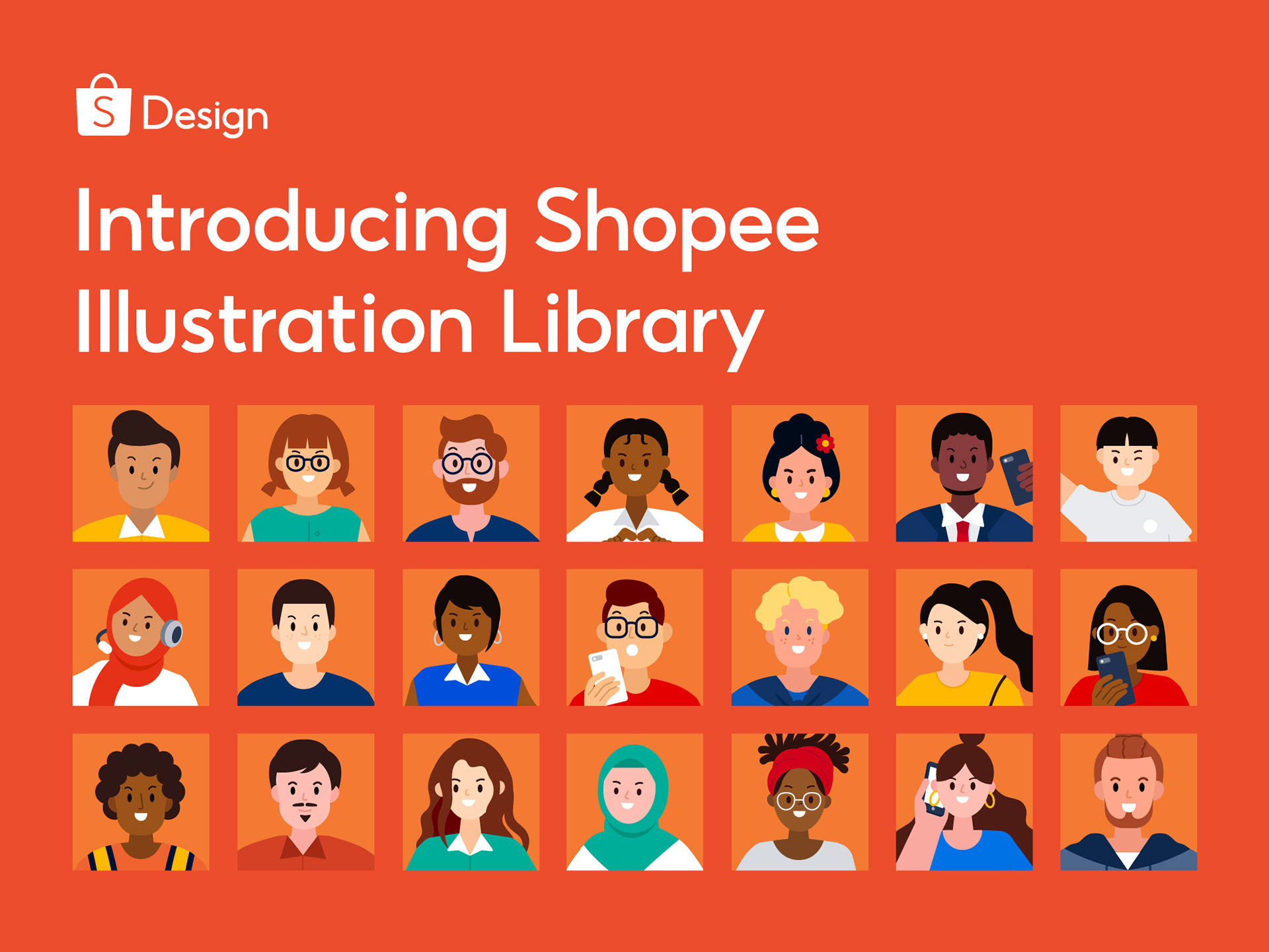
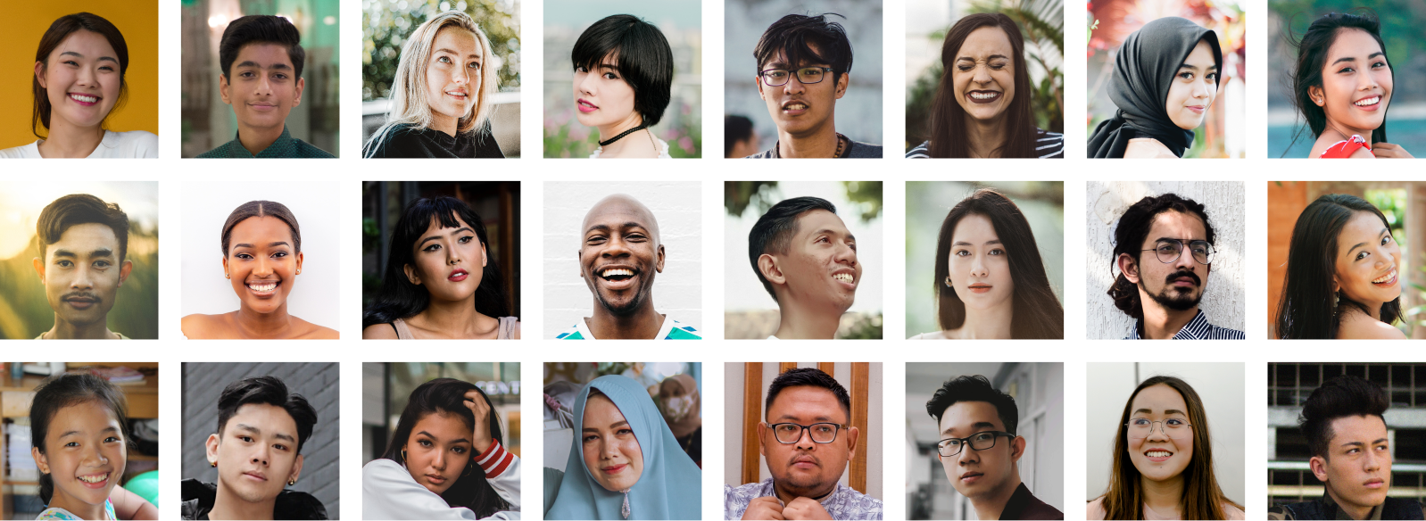
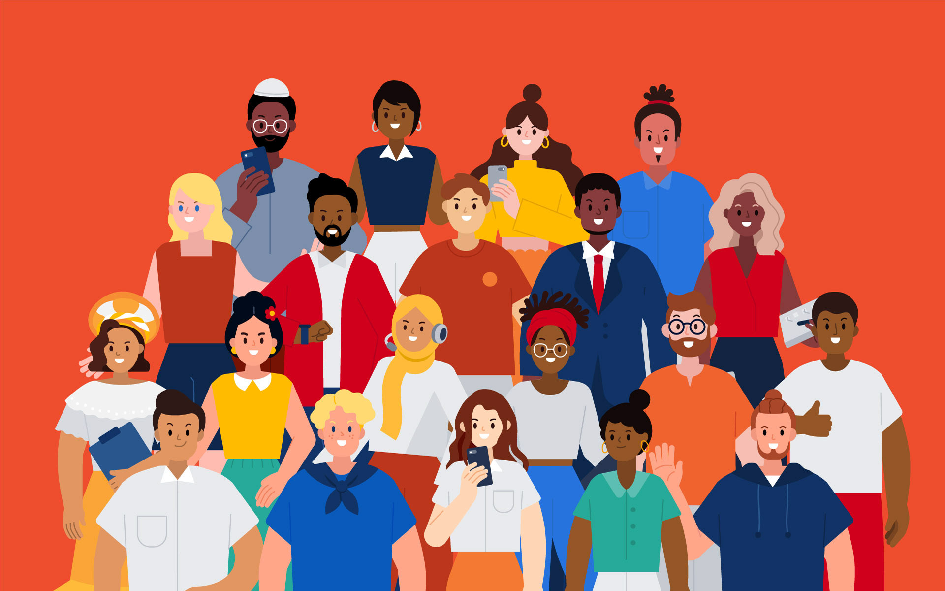
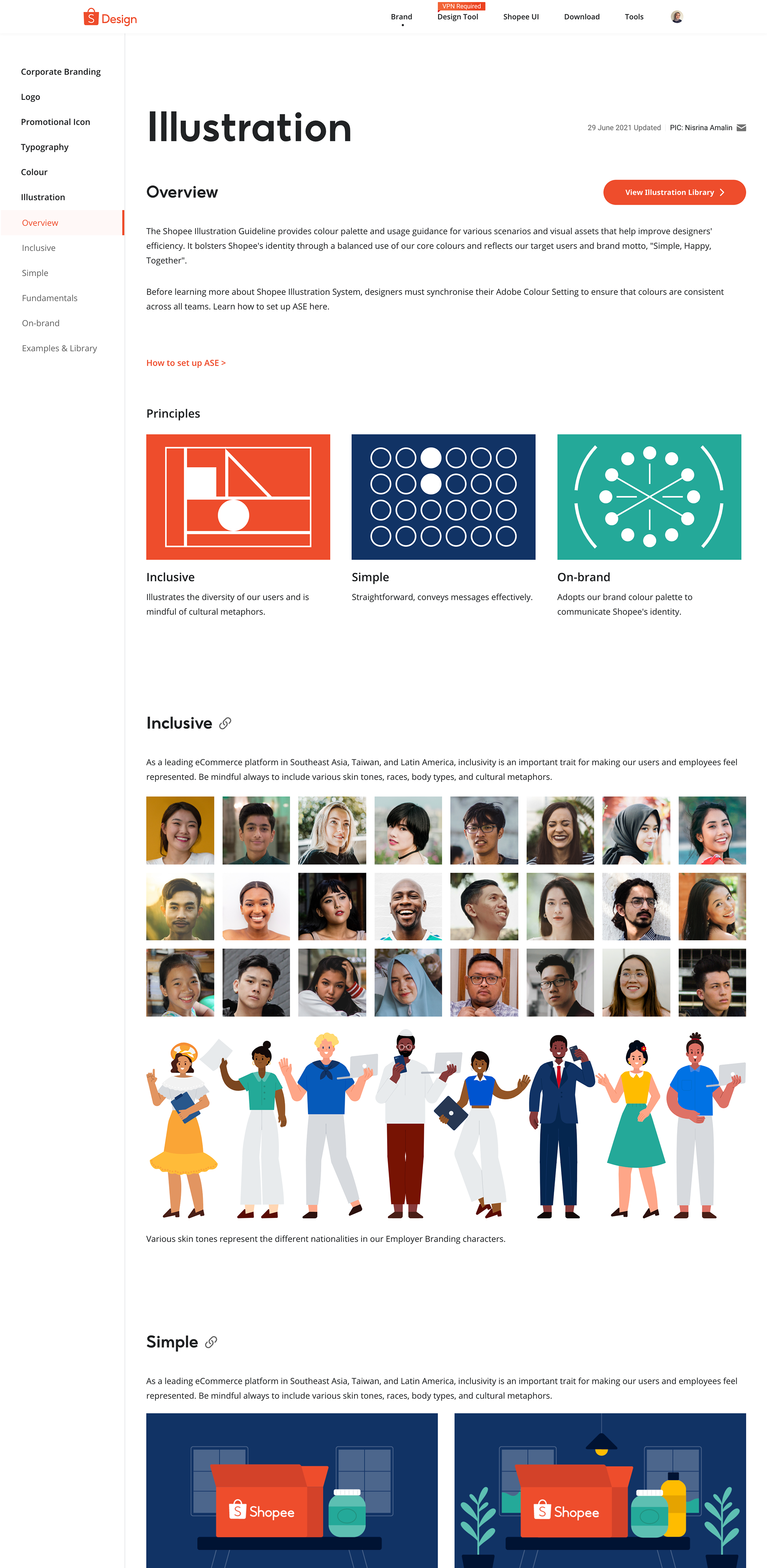
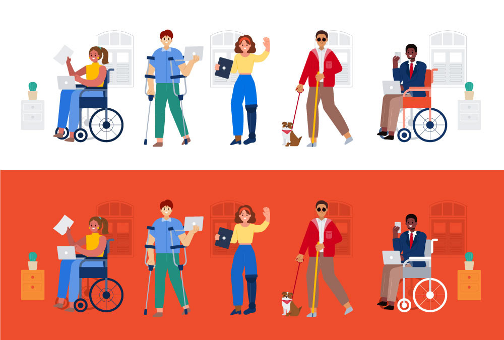
c. Inclusive. The Illustrations style should include different skin colours, body types, and cultural metaphors. They should represent the diversity in Southeast Asia, Latin America, and other possibility of Shopee new markets in various region, expressing happiness and togetherness within the Shopee brand.
4. Define the style
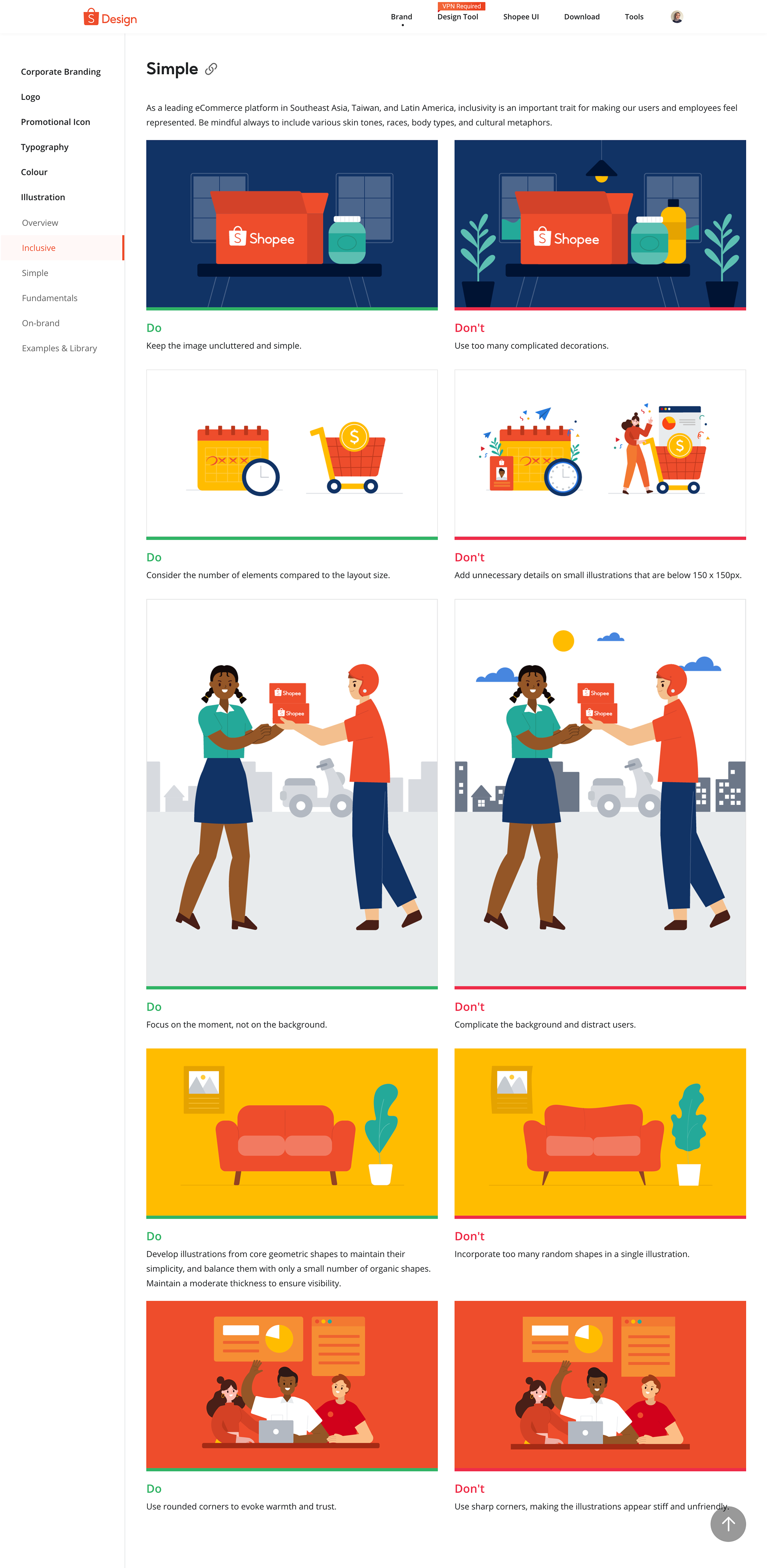
a. Simple
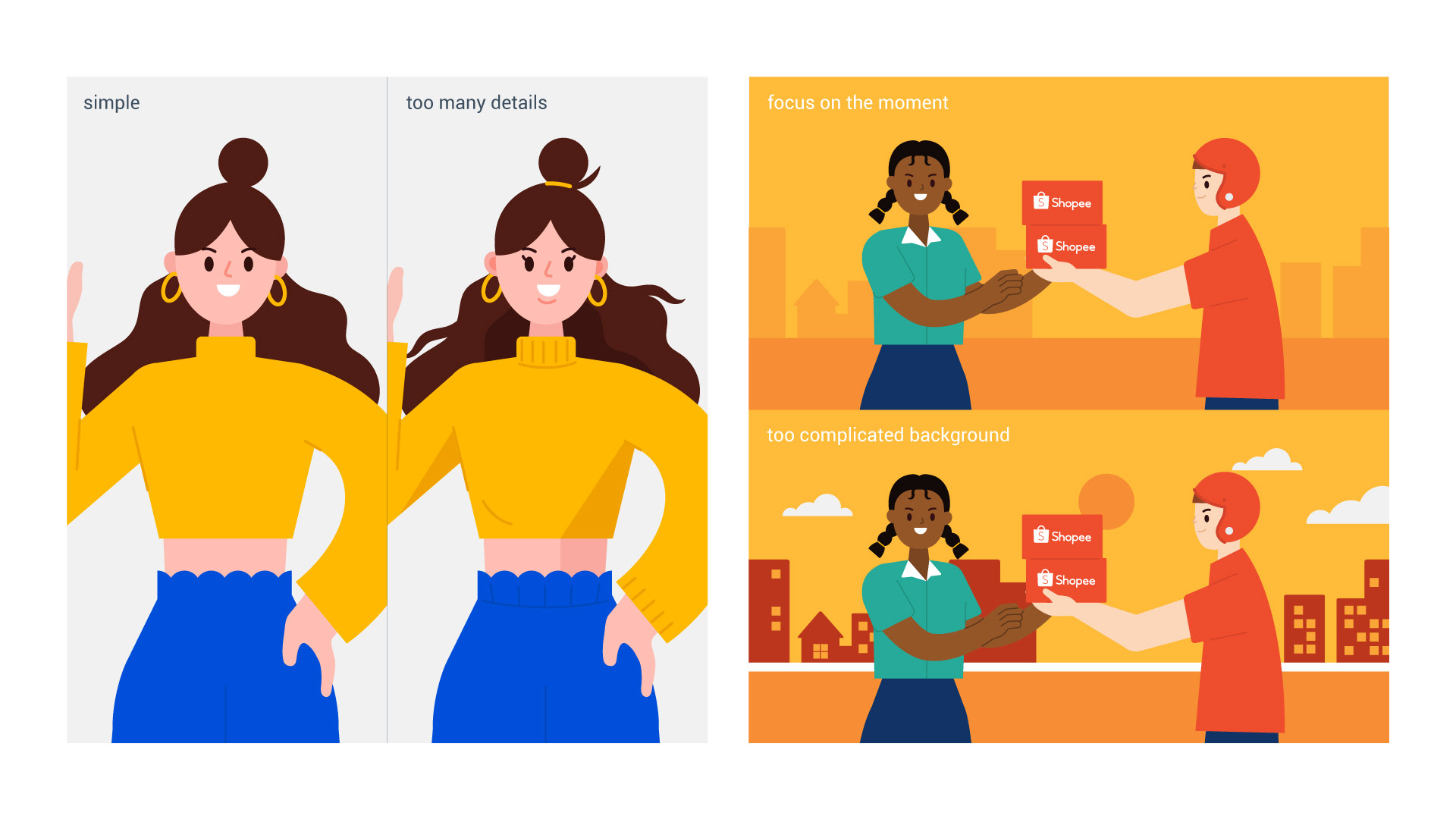
As most of the illustrations will be displayed on-screen, we wanted to make them as simple as possible to avoid visual fatigue. So I created objects based on structured geometric shapes and refrained from excessively using organic shapes.
I also tried to minimise intricate details and complicated backgrounds to help the audience focus their attention on the primary object. Additionally, I wanted to avoid making the elements appear too small and cluttered when viewed on smaller screens. Hence, I decided to do away with unnecessary decorative elements.
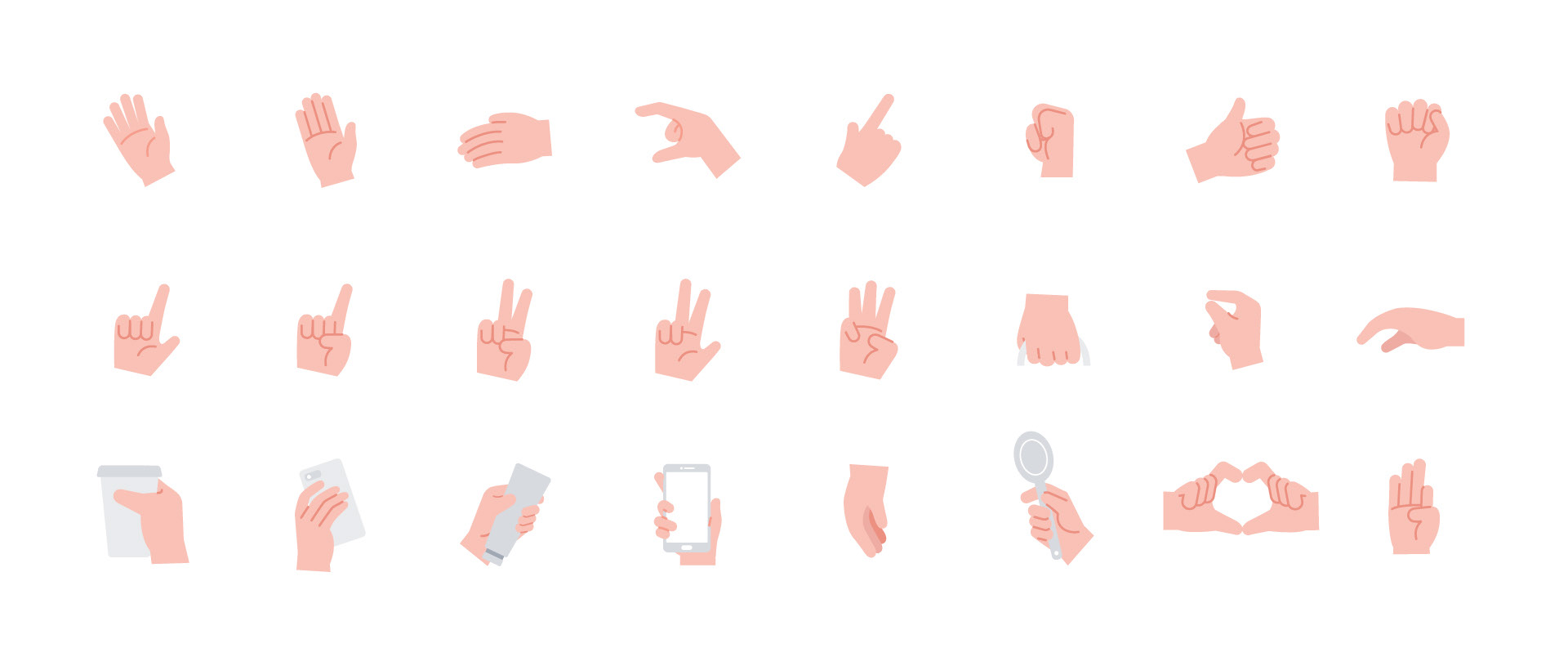
b. Scalable
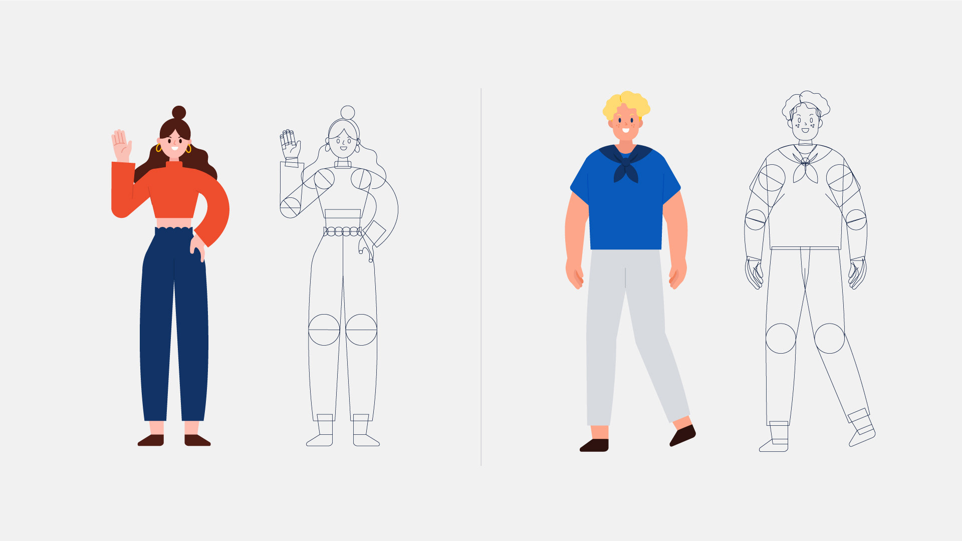
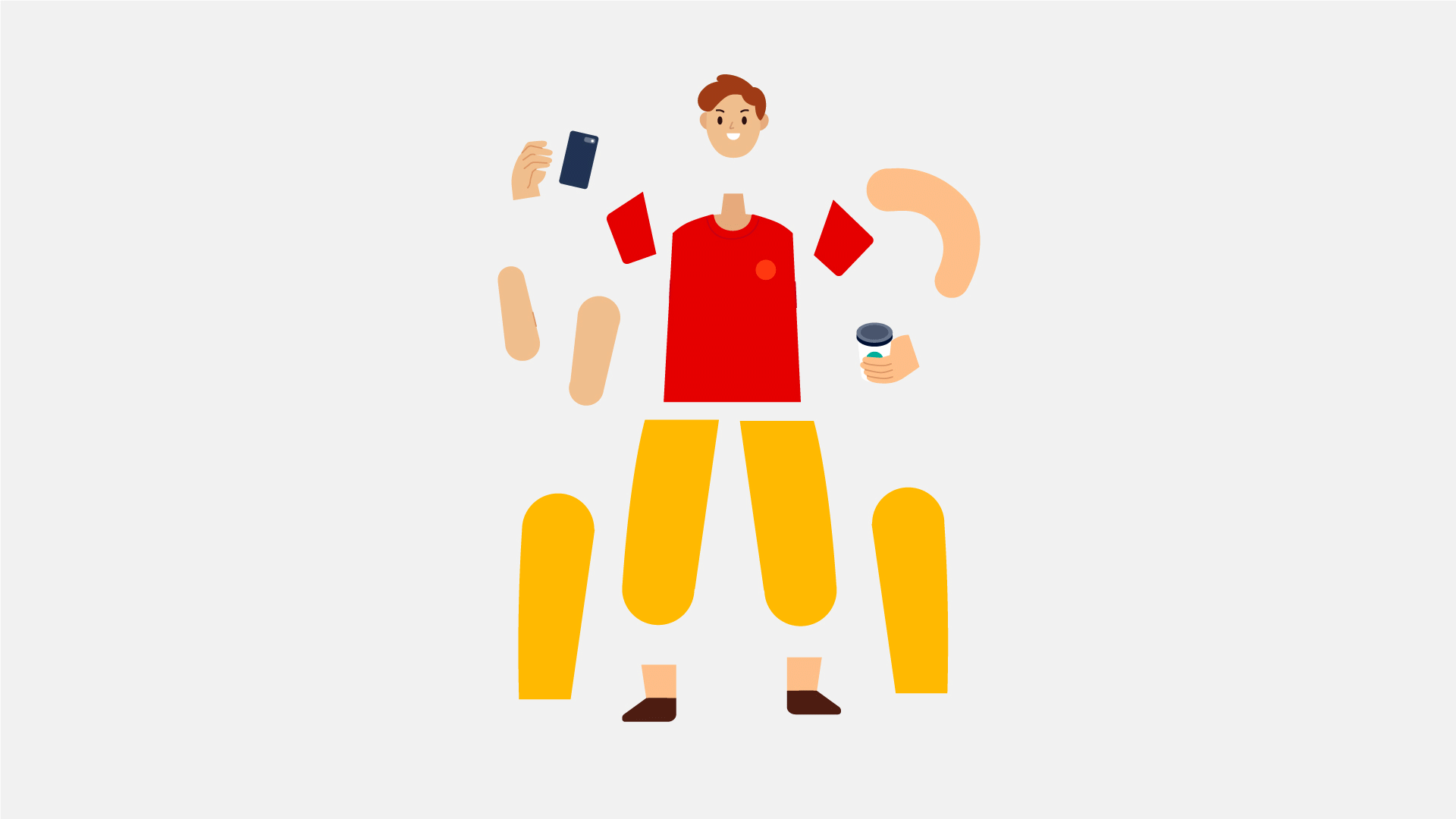
I envisioned a system where designers can easily customise components to suit their varying illustration needs. By referring to the principles discussed in Atomic Design Methodology by Brad Frost, I was able to apply them to illustrations, too.
Here’s an example of how I used the same hand component on two different characters. I also thought about providing other components to allow designers to pick the parts they want when building their character.
c. Inclusive
When expanding the characters, we tried to be mindful, ensuring that we show inclusivity in our designs. We provided various body types and skin colours to represent people of all ethnic backgrounds from Southeast Asia and Latin America.
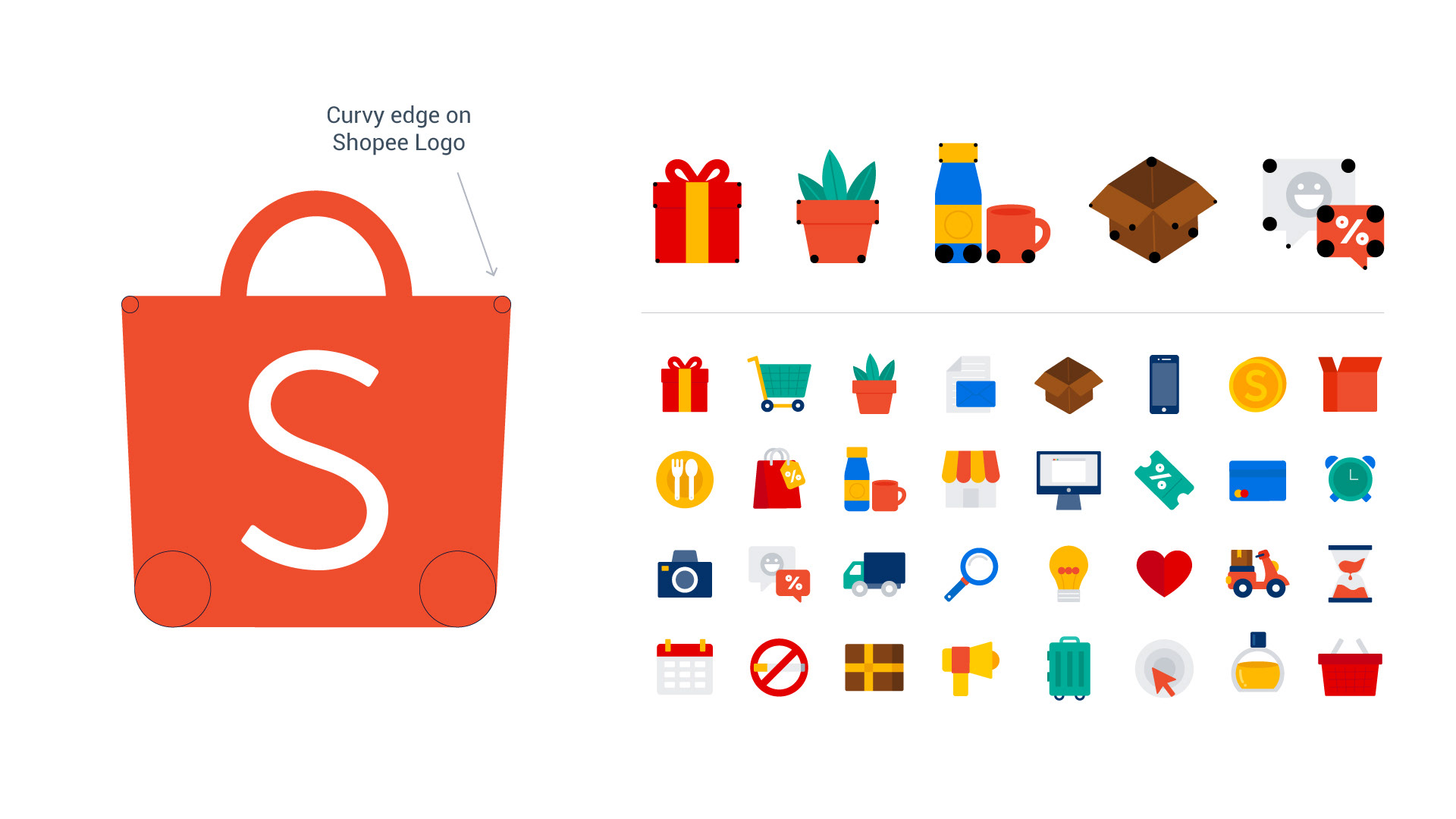
Small Details Matter
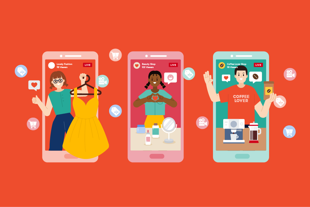
A set of individual objects was also included in the library. We adapted the style from our Shopee logo to evoke a fun and youthful vibe and align them with our icon system.
5. Creating the guideline and expanding it into a library
Illustration Guideline
I listed all the possible rules, reviewed existing designs and thought about the parts we could improve. The illustration guideline is important so every designers can recreate/customize the illustration when it's needed while maintaining the consistency.
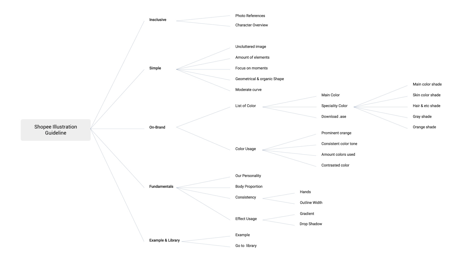
When the guideline first launched, I put the guideline content on pdf files and distribute it to all the teams in HQ and local offices. Then, with the help of UI/UX designers & developers, our team build a brand section on our internal design website to display the lllustration Guidelines. We thought It will be more efficient as we can easily share the link and updated the guidelines without updating and distributing the files over and over again.
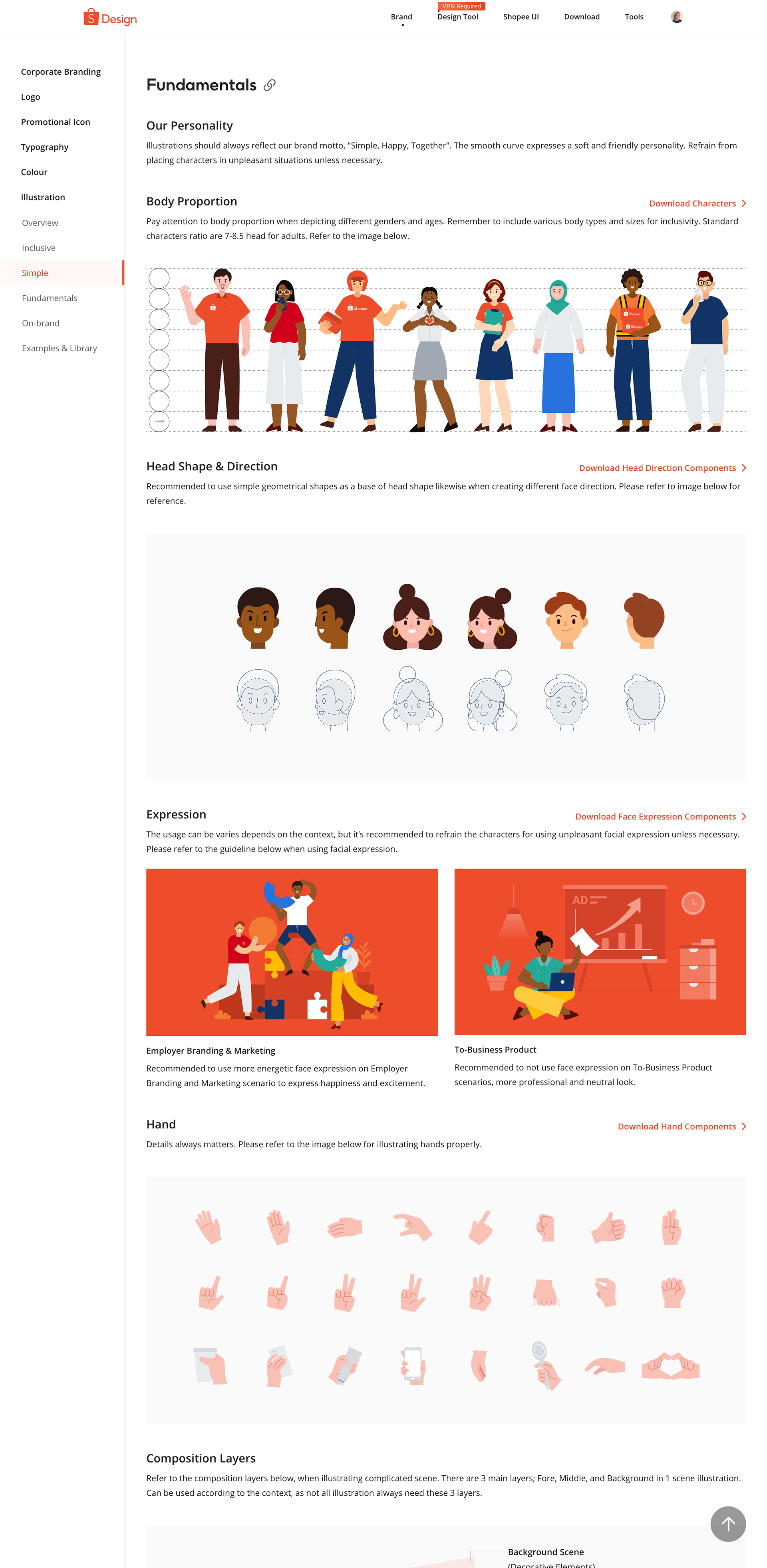
Characters Components
We also added character components such as hands, face, and body to the library. These components make it easier for designers to pick the desired pieces and create their customised character.
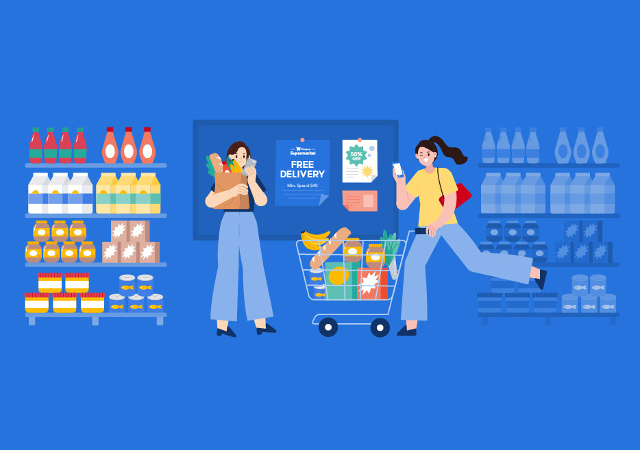
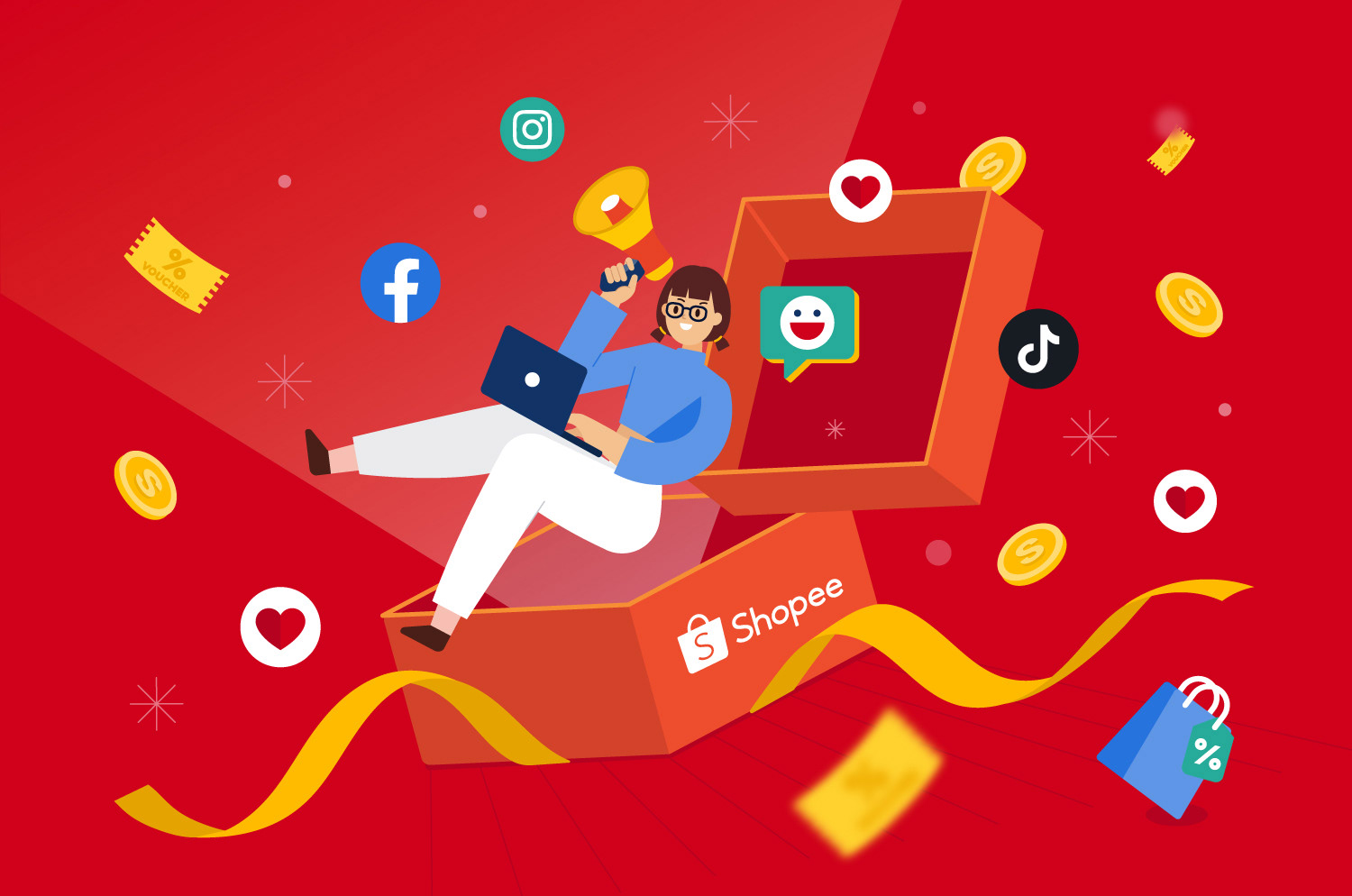
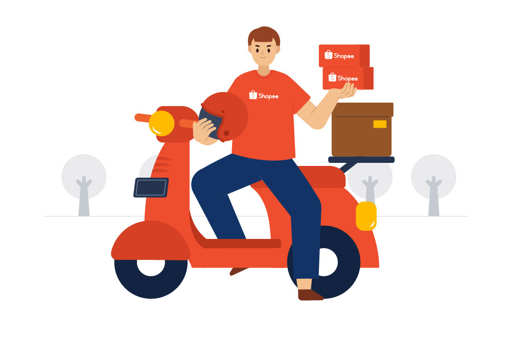
With all those materials, me with the help of other designers then expanded them to various scenarios and illustrations for employer branding and marketing.

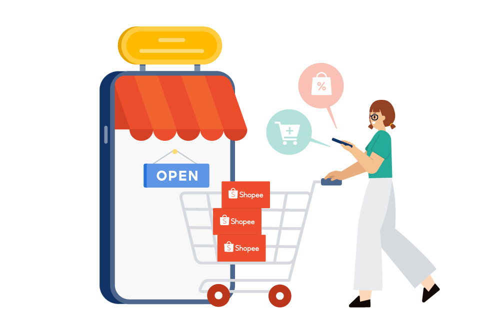
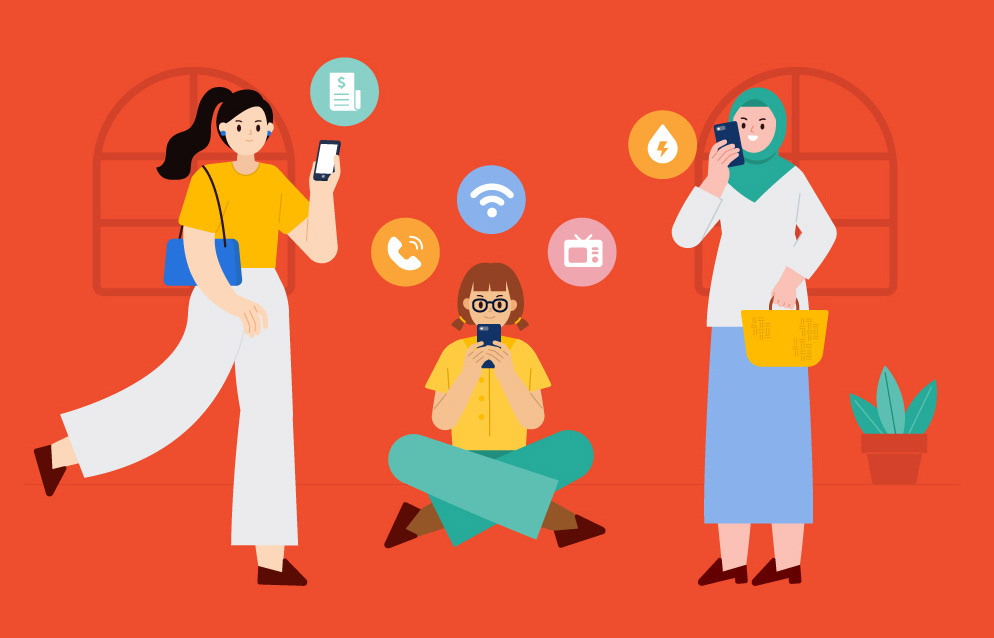

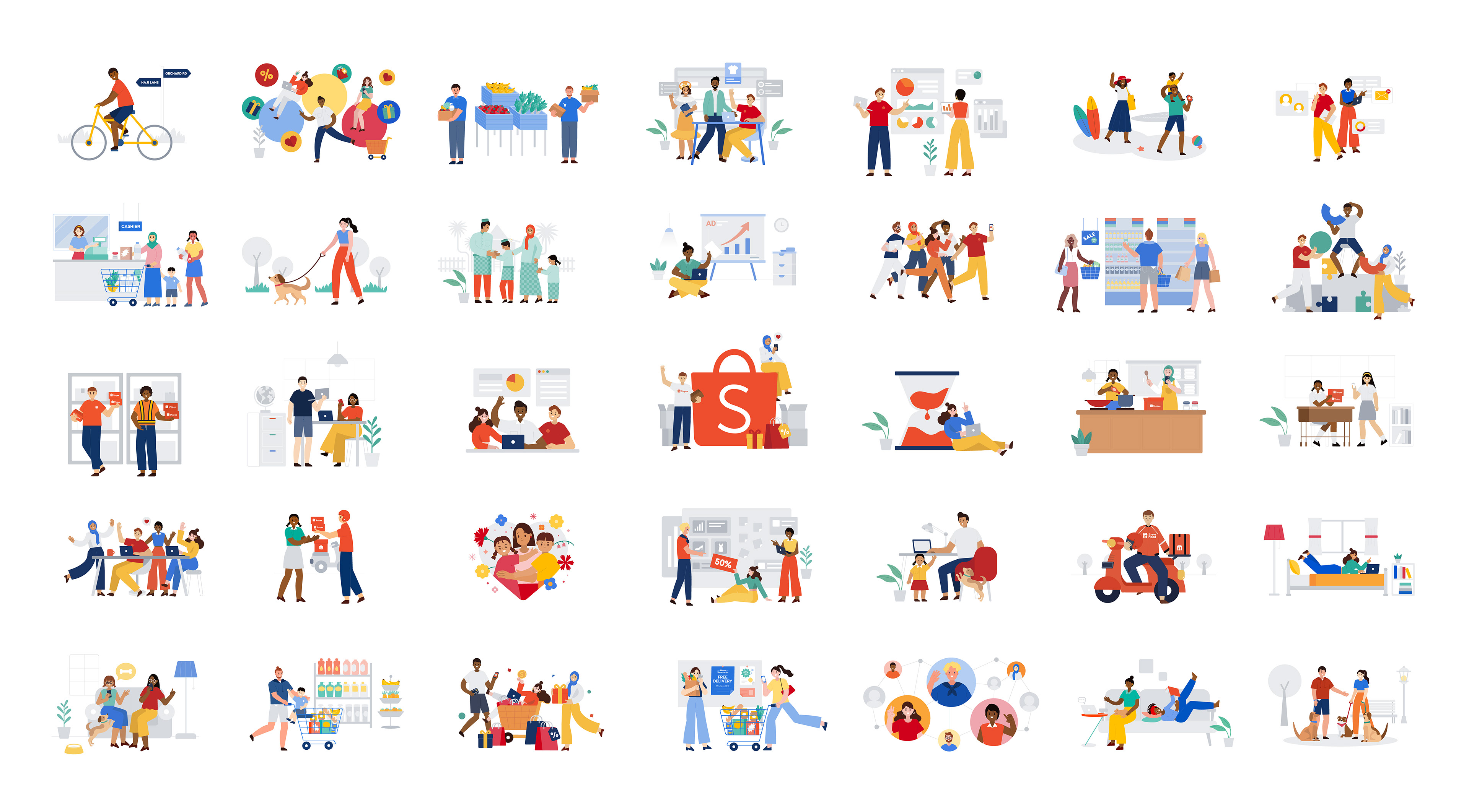
Application Showcase
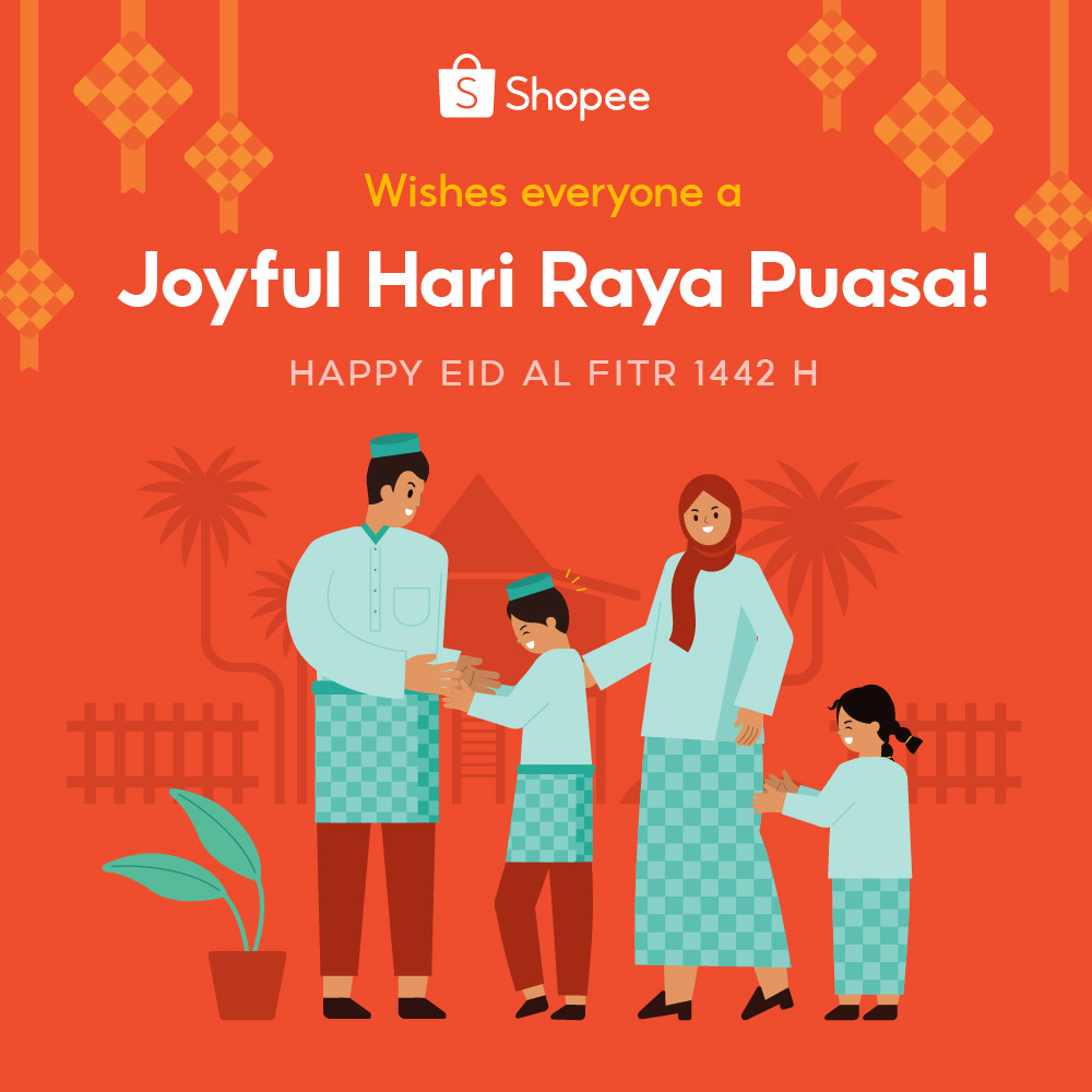
Hari Raya Card 2021
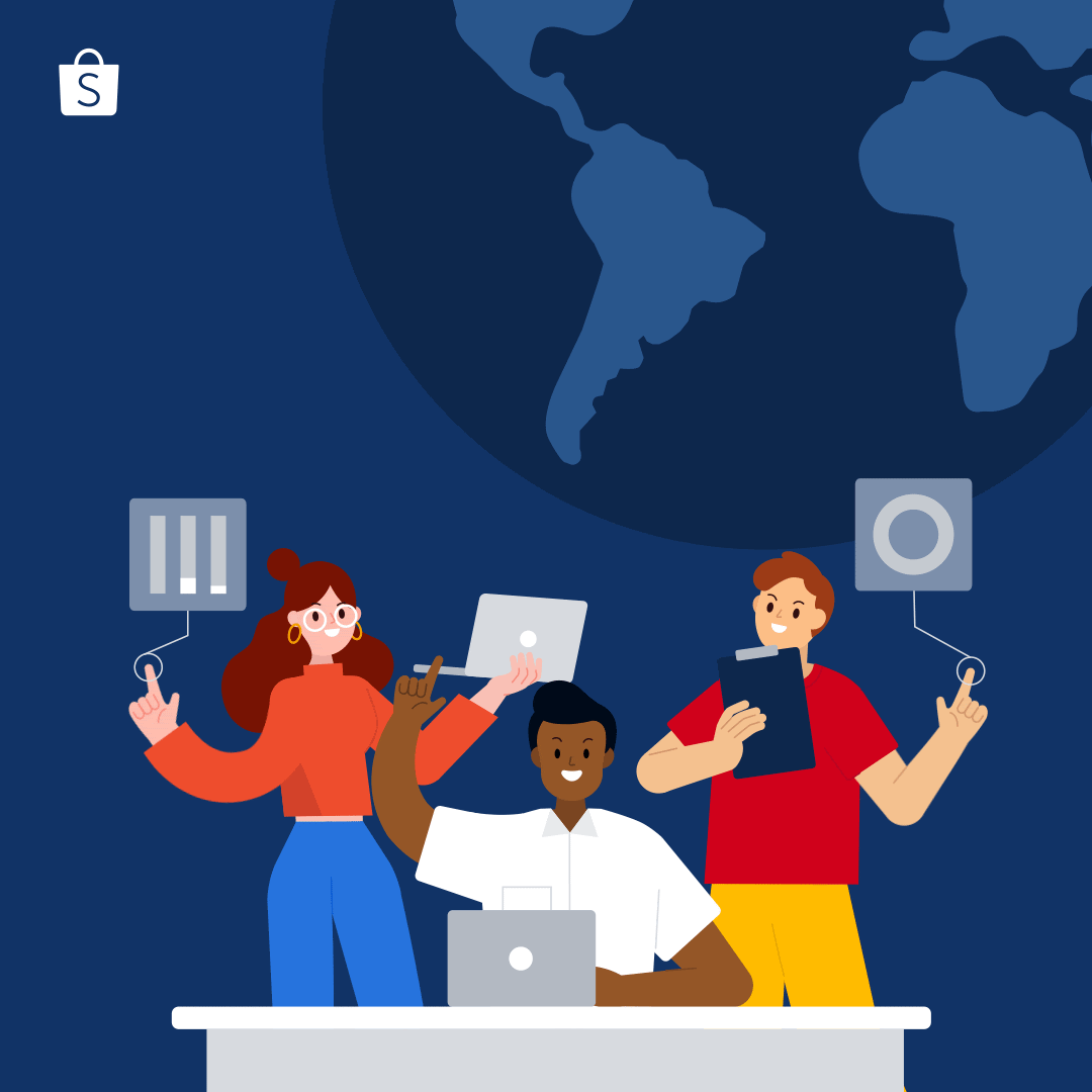
Engineering Day Post 2021
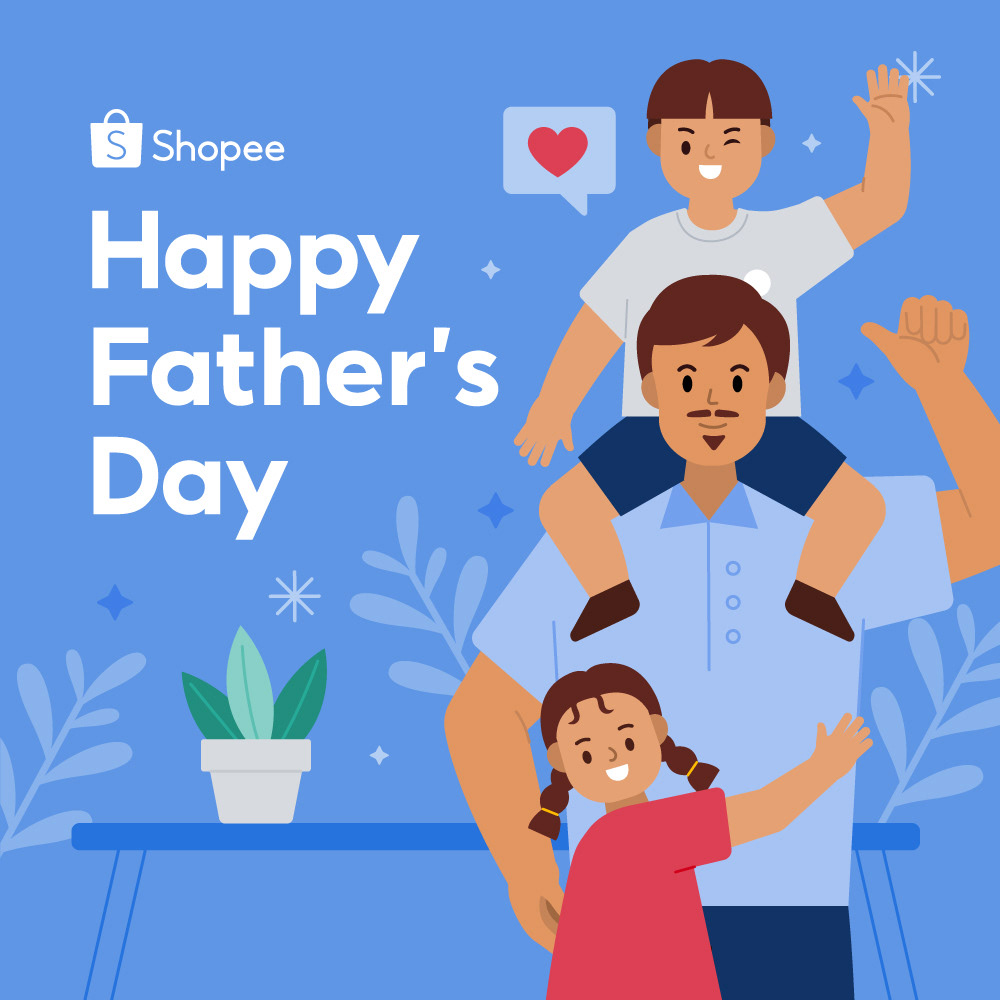
Father's Day Greetings 2021
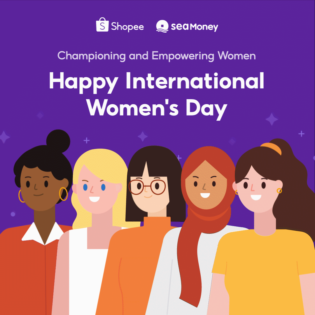
Women's Day Post 2021
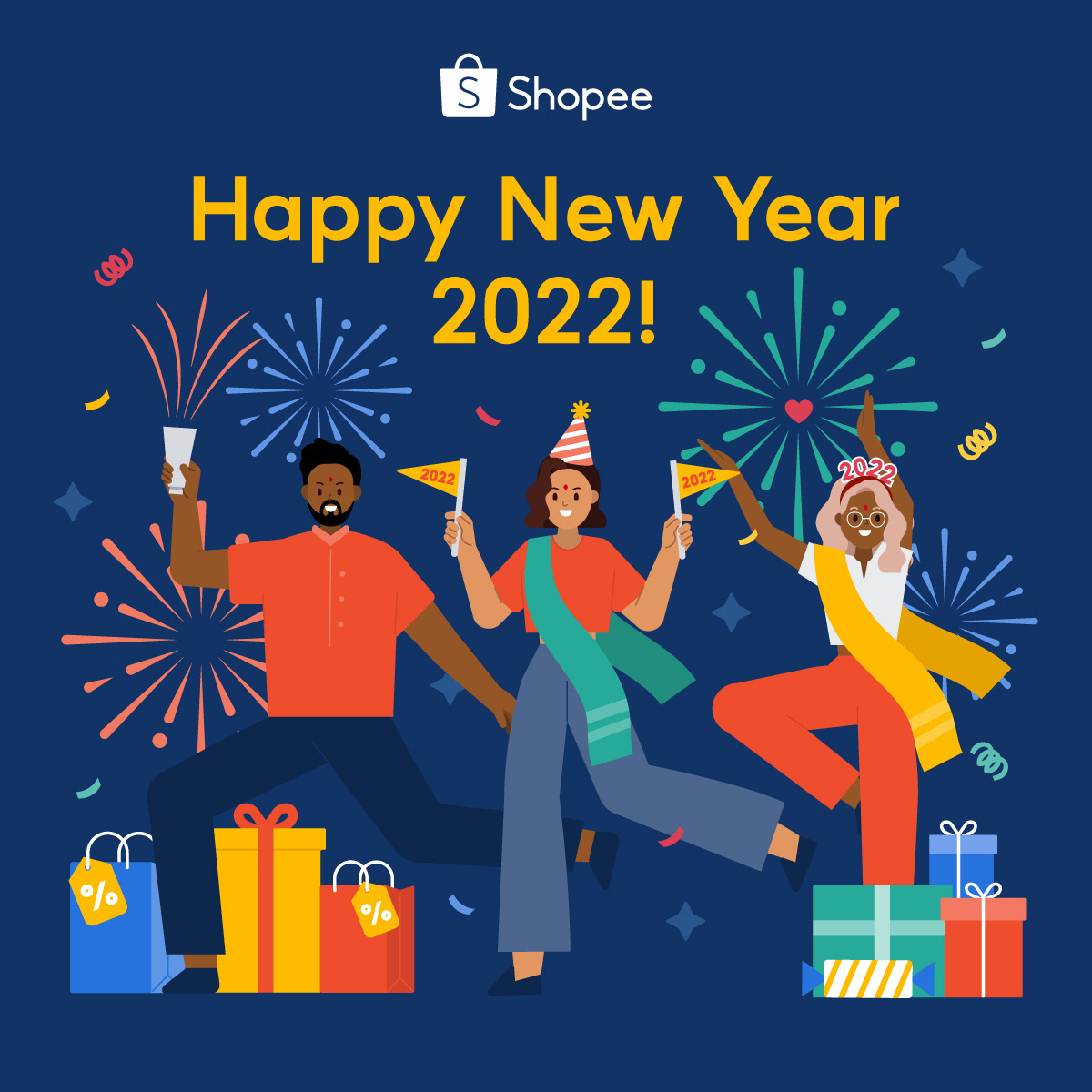
New Year Greetings for India Market 2022
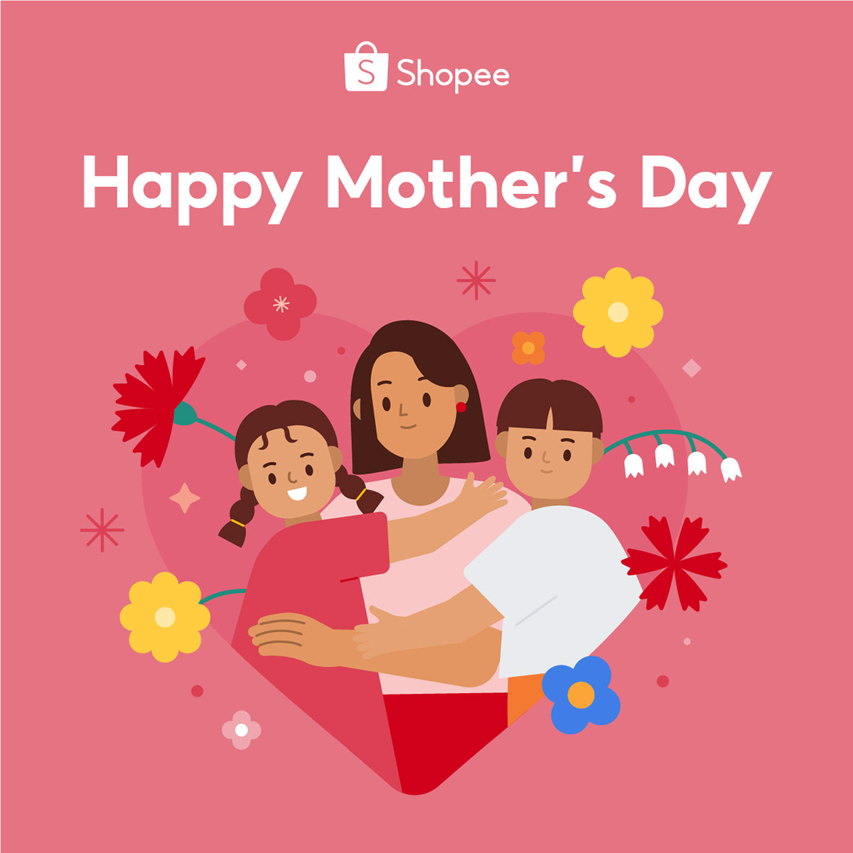
Mother's Day Greetings 2021
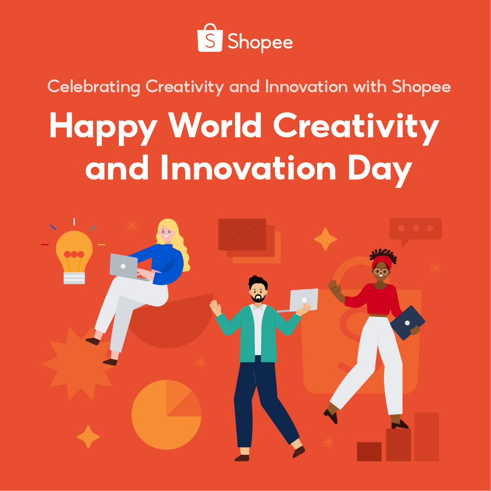
Creativity & Innovation Day 2021
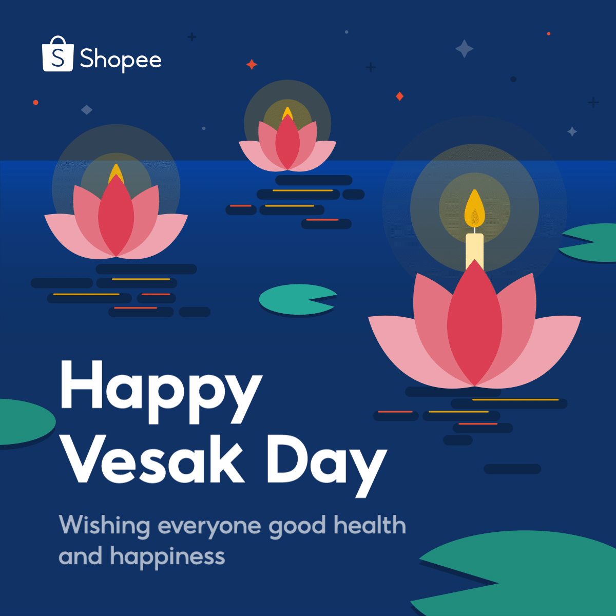
Vesak Day Greetings 2021
Tech@Shopee Recruitment Video 2022
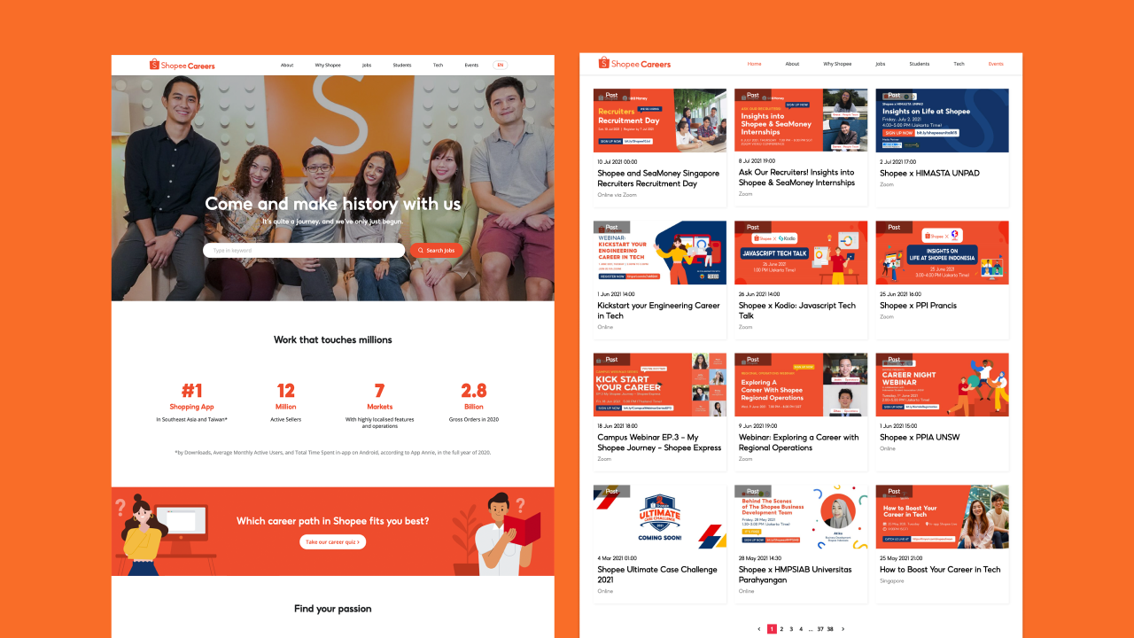
Shopee Careers Website
Lead Illustrator & Art Director:
Nisrina Amalin
Illustrators Team for the library:
Bohao Zhang, Yewchin Gan, Zhao Tingting, Amna Oriana, Feriga Chong, Lyuu Lew
Motion Grapher:
Batrisyah Suryadarma, Kiyasatina Azib
Brand Design Lead:
Estella Guo
Article written by Nisrina Amalin, Edited by Denise Chua. The original article was originally published on Shopee Design medium in 2021.